86 Using Graphics in Presentations
NSCC; Jordan Smith; and Verna Johnson
Graphic illustrations are essential tools in business documents. They help you interpret and present information visually, often making complex ideas easier to understand. Whether you’re preparing a formal report or a presentation, visuals like charts, tables, diagrams, and infographics can enhance your message and keep your audience engaged.
Why Use Graphics?
There’s a reason people say, “A picture is worth a thousand words.” Even when writing is clear and concise, readers often benefit from a visual that summarizes or supports your points. Effective graphic illustrations do the following:
-
Emphasize key numerical or factual data
-
Present information in a concise, convincing way
-
Clarify dense or technical content
-
Break up long blocks of text for easier reading
This section introduces common types of illustrations and how to format and use them in business communication. It concludes with a special focus on infographics.
Choosing the Right Type of Graphic
Different types of graphics are best suited for different purposes. Here are a few ways visuals can support your writing:
Objects – Use photos, drawings, or diagrams to show what something looks like. For example, if you’re explaining how to assemble a product or identifying parts of a machine.
Numbers – Use tables, bar charts, pie charts, or line graphs to display and compare data. For example, showing a company’s quarterly sales or customer satisfaction trends.
Concepts – Use organizational charts or diagrams to explain relationships, structures, or workflows. For instance, how different teams interact in a company.
Words – Use text boxes or callouts to emphasize definitions or key ideas.
Types of Graphic Illustrations
There are several kinds of visual aids, including tables, pie charts, bar charts, line graphs, flow charts, line graphs, organizational charts, illustrations, and infographics. Each type of visual aid best depicts a specific type of information. Knowing which visual aid best presents your raw data is important in creating effective visuals that communicate clear and accurate information. Watch the video below for an overview of when to use different types of graphic illustrations.
Video 11:10: Selecting the Best Chart Type | Running Time: 12:07
Which is the best chart: Selecting among 14 types of charts Part I | Published by 365 Data Science | Sep 4, 2018
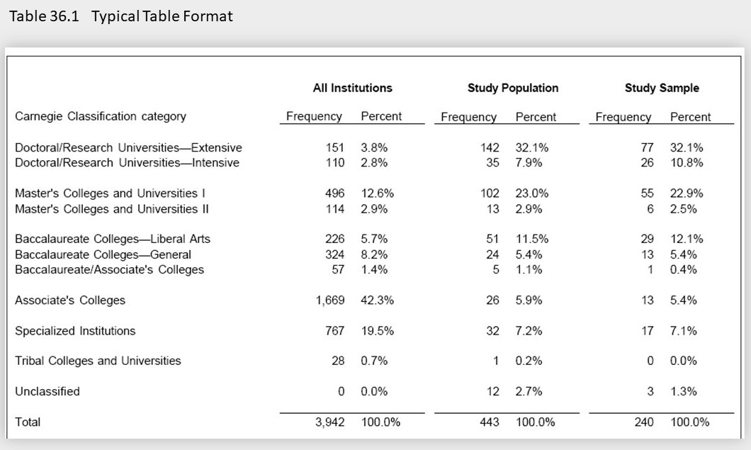
Tables present data in rows and columns, making comparisons easy. Use them to show large sets of detailed information clearly. See Figure 11.6 for an example.
Tips for effective tables:
-
Keep tables on one page.
-
Label each row and column clearly, including units of measurement.
-
Shade alternating rows for easier reading.
-
Use “n/a” or dashes to indicate missing data.
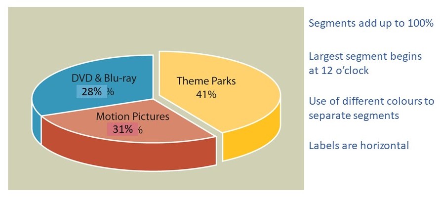
Pie Charts
Pie charts show proportions of a whole. They work best when comparing parts that total 100%. See Figure 11.7 for an example.
Tips for effective pie charts:
-
Limit to 4–6 segments; combine smaller values into “Other” if needed.
-
Use distinct colours and horizontal labels.
-
Start segments at the top (12 o’clock) and go clockwise.
Bar Charts
Bar charts show comparisons between categories or over time using horizontal or vertical bars. See Figure 11.8 for an example.
Tips for bar charts:
-
Keep bar width consistent.
-
Start axis at zero to avoid misleading impressions.
-
Avoid overcrowding with too many labels.
-
Place bars close together to make comparisons easy.
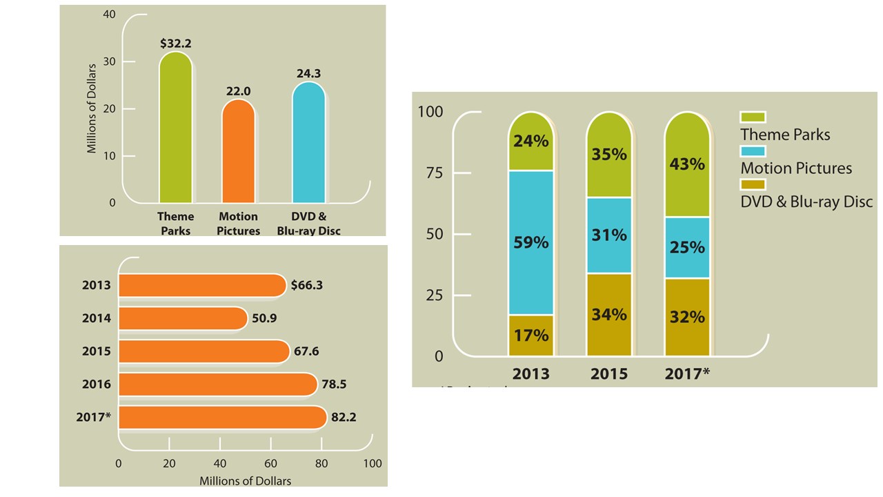
Line Charts
Line charts track trends or changes over time using lines to connect data points. See Figure 11.9 for an example.
Tips for line charts:
-
Time is shown on the x-axis; values on the y-axis.
-
Use different lines (solid, dotted, etc.) to show multiple variables.
-
Include a legend if needed.

Flowcharts
Flowcharts outline a process or workflow using shapes and arrows.
-
Ovals signal start or end points.
-
Rectangles show steps or tasks.
-
Diamonds indicate decisions.
These visuals are helpful for showing procedures or troubleshooting processes.
Photos and Illustrations
Use images when showing appearance is essential—for example, a product photo, map, or facility layout.
Choose high-quality, high-resolution images. In digital formats, animation or zooming can enhance engagement.
Infographics and Data Visualization
Infographics combine graphics, text, and data to tell a story visually. They’re useful for summarizing complex information and presenting it to a broad audience.
Infographics help by:
-
Attracting attention
-
Simplifying complex content
-
Telling a visual story
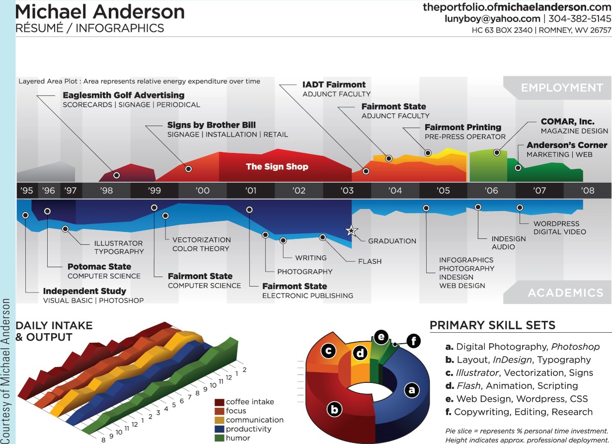
Types of Infographics
Infographics come in different formats depending on their purpose:
-
Static: Simple images without motion or interaction
-
Animated: Include moving elements, often used on social media
-
Interactive: Readers click or scroll to explore content, ideal for large or complex data sets
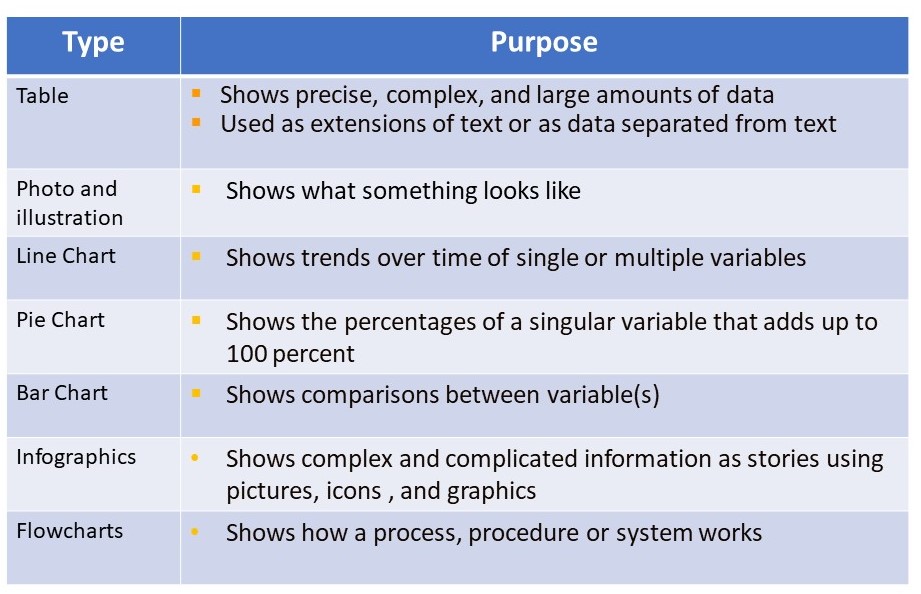
Table 11.7 below summarizes the types of graphic illustrations mentioned above.
Table 11.7: Types of Graphic Illustrations and their Uses
Activity 11.3: Check Your Knowledge
Formatting Graphics
To make sure your visuals are professional and effective, follow these basic formatting guidelines:
Titles – Every illustration needs a descriptive title. Place titles above tables and below all other figures.
Labels – Clearly label chart axes, data categories, or image components.
Captions – Add a short sentence to explain the image’s relevance. Don’t simply repeat the title.
Legends – Use legends to explain symbols, colours, or lines used in charts or diagrams.
Exercise
Review the bar chart in Activity 11.4 below. Each check mark presents information about a format requirement for graphic illustrations of all types.
Activity 11.4: Review a Bar Chart
Integrating Graphics Into Your Work
When using graphics in business writing, apply the following best practices.
-
Introduce each image in your text—explain its purpose.
-
Place graphics close to the related text.
-
Keep visuals readable and appropriately sized.
-
Avoid misleading graphics by manipulating scale or omitting data.
-
Don’t isolate graphics on their own page; integrate with text.
Citing Visuals
If you use any image, chart, or table from an external source, you must cite it, just like text-based sources. Watch Video 11.11 to learn how to properly cite the source of an image.
Video 11.11: How to Reference an Image From the Internet | Running Time: 3:42
How to reference an image from the Internet | Published by PolyU ELC | Mar 21, 2017
Creating Your Own Graphics
Tools like Canva, Venngage, and Piktochart offer free or low-cost ways to create visuals. Keep in mind:
-
Begin with an outline.
-
Keep fonts and colours consistent. Choose one or two easy-to-read fonts.
-
Keep text minimal—let the visuals speak. Emphasize the most important elements.
- Kee the message clear and concise.
-
Use a clear layout and logical flow.
-
Include labels, captions, and citations. Cite all images that you did not create or that do not have an open license.
You can also explore the following for design inspiration:
Attribution
This section was adapted from Chapter 36 “Graphic Illustrations and The Infographic” in Communication Skills and is used under a Creative Commons Attribution 4.0 International license.
References
References are at the end of this chapter.
Media Attributions
- table1a
- pie chart
- bar chart
- line
- infograhic 1
- graphic type summary
