Chapter 2: Mapping Essentials
Creating maps is one of the fundamental components of Geographic Information Systems (GIS). Thus, GIS professionals should be familiar with the mapping essentials and requirements. These mapping essentials are particularly important for the two widely used map categories i.e. Topographic and Thematic maps. One of the most essential concepts in mapping is map scale.
2.1 Map Scale
A map is a symbolic depiction of relationship between its elements. Maps can also be seen as a graphic representation of the Earth or an area. One of the main purposes of the map is to describe a spatial relationship between map features. A relationship between distances on the map with the distance on the ground is represented by a map scale. It is usually defined as a ratio of a distance on the map to the corresponding distance on the ground. Since a map is a 2D representation of the 3D Earth during which an image of the generating globe is projected on the developable surface, the scale is a ration of the size of the generating globe to the actual size of the Earth. It is called principal scale. However, map distortion occurs during the projection process, and the actual scale of a map at any given point can be different than the principal scale. A ratio of the principal and the actual scale defines the map distortion at that point. However, if the map distortion is negligibly small, principal scale can be used for the entire map. Map scale has its direct effect on the map details as large-scale maps can cover smaller areas showing greater details, whereas small-scale maps can cover larger areas with fewer details. Thus, selection of the proper map scale is a crucial factor in the map-making process. A cartographer should make sure that all the features of interest are correctly displayed and measurable before choosing the map scale. The choice of map scale also depends upon the area required to be covered by the map, the print size of the map, and the level of generalization for map features. It can also be desired by the map user agency or organization.
There are three ways to show scale on a map.
2.1.1 Representative Fraction (RF)
It is shown on the map by using ratio sign “:” where the left side of the ratio is always 1 representing distance on the map. The right side of the ratio represents the ground distance. No units are used to express representative fraction on the map; thus, it allows any linear units of distance to be used for calculations. It is one of the accurate methods of representing map scale. Typical representative fractions used on North American maps are as given in Table 2:
|
Scale |
1 Inch on map = Ground Distance? |
1 cm on map = Ground Distance? |
|
1:20,000 |
≈ 1,667 feet |
= 200 m |
|
1:24,000 |
= 2,000 feet |
= 240 m |
|
1:25,000 |
≈ 2,083 feet |
= 250 m |
|
1:50,000 |
≈ 0.8 miles |
= 500 m |
|
1:62,500 |
≈ 1 mile |
= 625 m |
|
1:63,360 |
= 1 mile |
≈ 634 m |
|
1:100,000 |
≈ 1.6 miles |
= 1.0 km |
|
1:125,000 |
≈ 2 miles |
= 1.25 km |
|
1:250,000 |
≈ 4 miles |
= 2.5 km |
|
1:500,000 |
≈ 8 miles |
= 5.0 km |
|
1:1,000,000 |
≈ 16 miles |
= 10.0 km |
Table 2: Typical representative fractions used on North American maps.
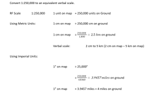
2.1.2 Verbal Scale
Another way of expressing map scale is to use a phrase which is easy to say, write, and understand using linear units of measurements. This method of expressing map scale is called verbal scale. Expressing map scale as 1 cm to 2 km or 1 inch to 2 miles are examples of verbal scale. It may be represented by using “=” sign. However, units need to be expressed on both sides of “=” sign. These units must be of the same system of units. Unlike RF, the left side of the “=” sign do not have to be 1. It is perfectly acceptable to say that 2cm on map are equal to 5 km on ground (2 cm = 5km). The right side of the verbal scale (ground distance) can be rounded to achieve expression simplicity and thus it cannot be used for precise map calculations. It is important to note that RF can be converted into verbal scale by using bigger units (km or miles) for the right side of RF and rounding it for expression simplicity. However, converting verbal scale to RF may introduce rounding errors in the calculations.
2.1.2.1 Example
2.1.2 Scale Bar
Scale bar is a graphic tool to express map scale which allows the use of fractional units. Both metric and imperial linear systems of units can be used on the same scale bar. It is one of the easiest methods to express map scale. The bar can change its size on different zooming levels and thus is best suited for digital maps. A variable scale bar can be used for large maps having systematic map distortion variations as it can show map scale at different latitudes and/or longitudes.
2.1.3 Calculating Map scale.
Map scale can be calculated by measuring distance between different features on the map.
2.1.3.1 Calculating Map Scale from a Known Feature
Following steps can be followed to calculate map scale from a feature with known measurements.
Step 1: Make measurements on the map.
Step 2: Write Scale using “=” sign.
Step 3: Make left side equal to “1”.
Step 4: If required round it and write VS.
Step 5: Make units same on both sides.
Step 6: Remove units and write RF.
2.1.3.1.1 Calculate map scale if length of a US football field is measured 0.5” on the map.
STEP 1: 0.5” on Map, 100 yards on ground
STEP 2: 0.5” = 100 yards
STEP 3: 1” = 200 yard
STEP 4: 1” = 200 yards Verbal Scale
STEP 5: 1” = 200 x 3 x 12 = 7200”
STEP 6: 1:7,200 Representative Fraction
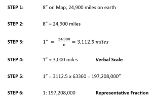
2.1.3.1.2 Calculate map scale if length of an equator is measured 8” on the map given circumference of the Earth is 24,900 miles.

2.1.3.1.3 Calculate map scale if 1o latitude spacing on the map is measured 2 cm, given circumference of the Earth is 40,000 km.
Map is usually defined as a graphical representation of an area showing spatial relationship between its elements. They are used to convey a desired information to its audience; thus, cartographers should be only including the selected or required information to avoid overcrowding. Every cartographer should also include the following ten cartographic elements to facilitate information from the map. These cartographic elements are particularly important for the two widely used map categories i.e. Topographic and Thematic maps.
2.2.1 Map Title
Every map is created with a specific purpose in mind and is designed to convey the specific information. The title of the map helps its readers to understand the purpose of the map. The map title should be concise and meaningful so that it can properly covey the desired use of the map. The text used for the title usually has the largest font size on the map layout. It is often placed on the top of the map but does not have to be at the top and can be placed on a box.
2.2.2 Map Legend
Map uses symbols and colours to represent features. These symbols and colours need to be decoded to extract information from the map. Map legend is key to decode symbols and colours representing different objects and features on the map. Thus, map legend must be included on the map; otherwise, it will be extremely difficult to read map and to extract information embedded in the map. The map legend may include figures, shapes, lines, and colours. However, legend symbology must have the same size, weight, and colour as map symbology. Mismatched symbology may cause reading errors. A map legend should be clear and concise so that distinctive map characteristics can be identified. Often there is no need to include all map symbols in the legend. Self-explanatory map symbols can be excluded. It is important to note that the map legend is not the main map attraction but is used to identify main map features, thus its size should be large enough to facilitate the map reader but not so large that it can cause distraction. Similarly, its design and placement should not draw the focus of the map reader.
2.2.3 Map Orientation
Map orientation is necessary to establish spatial relationship between different map features, and it cannot be established unless map direction is known. North arrow or compass rose is usually used for this purpose; however, graticule or grid marks can also be used. There is no specific place to show north arrow, though it is usually placed on the top right or left corner of the map. The size and design of the north arrow or compass rose should not be dominating the map, and its placement should not catch th eyes of the reader.
2.2.4 Map Scale
Map scale is also essential to make measurements on the map and to establish spatial relationship between map features. Scale bar is commonly used for this purpose. However, the units expressed on the scale bar must be aligned with the system of measurement used in that area. Scale bar showing units in metric system should be used for Canadian maps whereas imperial units are used for U.S. maps. Both imperial and metric units can also be used on the same scale bar to avoid any confusion. It is usually placed at the bottom of the map page. Smaller length and thinner lines are preferred choices to show scale bars.
2.2.5 Map Border or Neatline
A border of the map expressing the extent of geographic data is called neatline. It is the most accurate map element. Other map features can slightly be moved or exaggerated for generalization or to improve map readability; however, neatline should never be adjusted. It does not always have 90o corners. The distance between the map and the neatline should be small and the same on all sides. This arrangement will create balanced and symmetrical maps.
2.2.6 Map Graticules
A network of lines or marks on a map that delineate the geographic coordinates (latitude and longitude) is called graticules and can be used with any projection system. Graticules are used to express map location. It is important to note that the graticules should not obstruct the map features and should not overcrowd the map.
2.2.7 Map Date
Map is an important document to convey information. The information displayed on the map can change over time. Thus, it is important to display map date so that the readers know that information displayed on the map was accurate up to that specific date. The map date should reflect the data acquisition date rather than the map creation date; however, both dates can be displayed to avoid any confusion. Smaller text fonts and lighter text colours should be used to display map date.
2.2.8 Cartographic Map Project
A map is a 2D representation of 3D Earth. Distortion occurs during this process. Some map projection systems can preserve shape while others can preserve direction or distance. Several map projection systems are used to create maps depending upon the area and theme of the map. The map features can appear differently depending upon the projection system used to create the map. It is important to indicate cartographic map projection system and datum used to display map features. All features on a map should be displayed using the same map projection system.
2.2.9 Data Source
Information displayed on a map can be misleading if it is not obtained from an authentic source or displayed inaccurately. The credibility of the map information depends on its data source. Thus, the data sources must be displayed on the map especially if it contains sensitive information such as political boundaries.
2.2.10 Cartographer Name
The cartographer has an ethical responsibility to create accurate maps. Some of these maps can be used for legal purposes. A map is also a document which can be cited in other publications. Thus, the name of the cartographer should be included on the map.
2.3 Supporting Maps
Some maps can serve to complement the main map created to convey the desired information. These maps may not always be required but can enhance the usability of the main map.
2.3.1 Locator Map
Cartographers sometimes need to create maps of unfamiliar areas. These areas are usually not very well-known. Locator maps are used to identify the location of these areas in a larger geographical context. The locator map is like any other map but covers a bigger area to specify the location of the area of interest.
2.3.2 Inset Map
A zoomed-in map of a smaller area to show fine details within the area, is called the inset map. It is a highly detailed map covering a smaller area. Thus, the scale of an inset map is significantly larger than the main map. It is a map within a map and can be used to focus on a particular area at a larger scale in greater detail, or to show different information for direct comparisons. It can also be used to show the information that cannot fit into the main map.
An inset map should be placed away from the visual page layout center so that map readers can clearly recognise it. Otherwise, they might consider it as an extension of the main map. Map designers should be careful while using inset map to avoid clustered appearance.
2.3.3 Index Map
Index map is a schematic map providing reference for a collection of map sheets. Map sheet and number are included in the reference map. It can also include other ancillary information including coverage extent and area covered by the maps. Index maps help to locate a specific map sheet.
2.4 Map Design Considerations and Principles
A map is a document used to convey spatial information to its audience. It is an excellent visual communication method to convey important spatial information. Cartographers need to be aware of the main goals and the message to be delivered through the map. Similarly, the cartographer must also know the technical knowledge level of its expected users and should avoid adding highly technical information on map created for the use of the public. The requirements of maps created for highly technical people will entirely be different than maps created for the public. Highly accurate data will be required for precision maps whereas feature generalization can be used for everyday-use maps requiring less accuracy. Similarly, design of paper maps could be different than digital maps. Cartographers can apply different principles to create good maps. The following five design considerations and principles should not be ignored.
- Legibility
- Visual Contrast
- Figure-Ground Organization
- Hierarchical Organization
- Balance and Symmetry
2.4.1 Legibility
Maps should be designed in a way that the information displayed on the map can be read, seen, and understood. Legibility of map depends upon the selection of familiar symbols, colours, and label fonts. An appropriate size for symbols and labels can also improve legibility. Smaller geometric symbols can be read easily but complex symbols may require larger sizes. However, labels and/or symbols should not overcrowd that map. The use of too many or too big symbols/labels can obscure other features on the map. A fine balance between number and size of symbols/labels will improve legibility.
2.4.2 Visual Contrast
Visual contrast refers to the difference in colour and its luminance to improve visibility of features. Contrast can be used to make desired features stand out from its background. Thus, important features which need reader’s attention should have high visual contrast. Low contrast can be used for features belonging to the same family. Adjusting contrast can result in crisp, clean, sharp-looking map. A good knowledge of colour theory can help in selecting suitable colours for features and to adjust the desired contrast.
2.4.3 Figure-Ground Organization
Figure-ground organization is used to make map features prominent from the background. It results in spontaneous separation of the features in the foreground from an “amorphous” background. It can be achieved by adding drop shadow, whitewash, or feathering. However, adding drop shadow is commonly used for this purpose. The use of figure-ground organization allows map users to focus on the desired area of the map.
2.4.4 Hierarchical Organization
Maps are created to convey a specific message using graphical techniques. Cartographers can steer the attention or focus of the map readers to a specific portion of the map through hierarchical organization. Some features or some areas of maps could be more important than others and the focus of a map reader needs to be drawn towards those important features or map areas. For example, the theme of a thematic map is usually more important than the base of the map. Thus, it should be made prominent so that it can immediately draw attention of the user. Similarly, inset maps require greater attention than the locator map. Similarly, the map itself is more important than the other cartographic elements. Thus, map elements such as title, legend, north arrow, and map scale should not be fancier than the map. Other cartographic elements such as cartographer name, map date, data sources, and projection system should be placed at the lowest order of hierarchical organization.
2.4.5 Balance and Symmetry
Symmetrical organization and distribution of the map and other cartographic element increase the visual appearance of the map layout, making it attractive and pleasing to its users. The map layout should maximise the available space. In addition to the well-formatted page layout, unclear names and abbreviation should be avoided to increase the map balance. A well-balanced map layout is soothing to the eyes and thus also facilitates map interpretation and the information extraction process. It conveys the cartographer’s professional attitude and shows that the cartographer was paying attention to details.
2.5 Map Symbols
Maps are visual form of communication and symbols are the language of maps. They are used to express the map contents and are composed of geometrical shapes of different colours and sizes. Pictures can also be used for symbols. Symbols can represent the spatial location, size, distribution, qualitative and quantitative characteristics of features presented on the map. Symbols can be divided into two main categories, i.e., explanatory symbols and positioning symbols.
Explanatory symbols refer to a kind of additional symbols for describing the quality and quantity characteristics of things, which usually exist based on positioning symbols, such as symbols for describing forest species. They are located within the boundaries of the Earth on the map, but they have no positioning significance.
Positional symbols are used to describe the spatial location and size of the feature such as roads, rivers, points of interest, urban areas, and the list goes on. Most of the symbols shown on a map belong to this category. The explanatory symbols are used to describe the qualitative and quantitive characteristics of features such as population density, literacy rates, and the list goes on.
Positional symbols are also used to represent features on the map. Thus, they should be selected with care for better representation of features. Its colour should mimic the natural colour of the feature it is representing. For example, blue for water bodies and green for vegetation. Positional symbols can also be point or line symbols. The shape and colour of the point reflect the nature of the feature, and its size may reflect its quantitative characteristics. However, the size of a point symbol does not relate with the map scale and should not be used for calculations. The point symbols are also called map scale independent symbols. Some of the point symbols are commonly recognised by the public. Using commonly known symbols will enhance map readability, interpretation, and its use. Linear symbols are used to represent linear features such as rivers, roads, and political boundaries. Polylines are usually used for this purpose. The length of the linear symbol is related with the map scale and can be used for length calculations whereas its thickness is not scale-related and is only used to portray the importance of the feature. Important features are usually represented by thicker lines.
Using symbols, maps can be divided into the following four categories.
- Single Symbol Maps
- Unique Value Maps
- Graduated Colour Maps
- Graduated Symbol Maps
2.5.1 Single Symbol Maps
Single symbol maps use the same symbol for all features in a layer having only one category such as cities in a state, a capital city of each state, or shopping malls in a city. Only location of the feature can be shown using single symbol maps as they do not specify the quantity of the feature. For example, showing cities within a state using single symbol does not describe the size or population of the city and it will only show its location. Dot distribution or dot density maps can convey feature quantities by showing more dots with increasing quantities. For example, cities having a population of less than 50,000 people may have only one dot whereas cities having a population of 50,000-100,000 will have two dots and so on. However, it may be tedious to count number of small dots for large quantities.
2.5.2 Unique Value Maps
Expressing only location of a feature may not be sufficient to meet the mapping requirements. Features of a map layer may also need to be classified based on their categories. Unique Value Maps are helpful to show feature locations and their categories. Different symbols and/or colours can be used to differentiate features in the map layer. However, unique Value Maps are usually used to represent data having small number of categories. For example, cities and towns within a state can be differentiated by using different symbols. Similarly, different colours can be used to show road speed limits within a city. Unique Value Maps work equally well for point, line, or polygon features.
2.5.3 Graduated Colour Maps
Graduated Colour Maps use graduated colour scale to represent feature variations or densities such as elevation changes, water depth, temperature differences, or population densities, where different shades or a range of colours indicate progression of numerical values. These maps are also called choropleth map. The data is usually classified into ranges and a specific colour are assigned to each range. Different shades of the same colour can also be used to indicate density variations. Colour ramps are usually used for this purpose. These maps work well for both discrete and continuous data. Graduated Colour Maps are one of the most frequently used maps in geography.
2.5.4 Graduated Symbol Maps
Like graduated colour maps, graduated symbol maps are also used to portray quantity associated with the feature. It is intuitive to use size of the symbol to represent quantity differences. Graduated Symbol Maps also divide data quantities into classes using equal interval, quantile, or natural breaks classification techniques. Specific size of symbol is used for each class. It may not depend on the geographical size of the feature. The size of circles and squares is easier to compare and thus preferably can be used as symbols for graduated symbol maps.
2.6 Map reference (Index) systems
Traditional paper maps have been printed by various private and public organization. A map reference or index system can facilitate the identification of these maps. A map of each area has a unique identification or index number which can help to order preprinted maps from the respective organization. Private publisher usually has their own indexing system; however, two indexing systems are commonly used in Canada by the public organizations.
- National Topographic System (NTS)
- Military Grid Reference System (MGRS)
2.6.1 National Topographic System (NTS)
Topographic map coverage of Canada is based on the National Topographic System (NTS). This system usually used to print maps at 1:50 000, 1:250 000, and 1:1 000 000 scales and are available through public organizations such as Natural Resources Canada (NRCan), Regional Distribution Centers (RDC), and certified map printers. These maps are used to depict ground relief (landforms and terrain), drainage (lakes and rivers), forest cover, administrative areas, populated areas, transportation routes and facilities (including roads and railways), and other man-made features.
Traditionally, blue is used for show water bodies. Brown is used for contour lines, spot elevations, and sands. Black for railway, powerlines, and administrative/political boundaries. Green for vegetation including forest, crop land, and parks. Red is used for paved roads and highways whereas unpaved roads are shown in orange. Any information added to the original map is shown in purple, and gray is used for the glossary of term used on the map.
The index map can be downloaded in PDF, KML, and SHP formats from the open-source website of NRCan at https://open.canada.ca/data/en/dataset/055919c2-101e-4329-bfd7-1d0c333c0e62
1:1,000,000 map sheets are identified by a combination of three numbers (e.g. 098) is marked by a darker and thicker line, usually dark gray. The number starts from the Atlantic Canada and increases upward in vertical columns. Prairie Provinces are covered by four columns (5, 6, 7, and 8) and three rows (2, 3, and 4). Thus, sheet number 52, 53, 54, 62, 63, 64, 72, 73, 74, 82, 83, and 84 cover the three Prairie Provinces. Indexation system of NTS is shown in Figure 8.
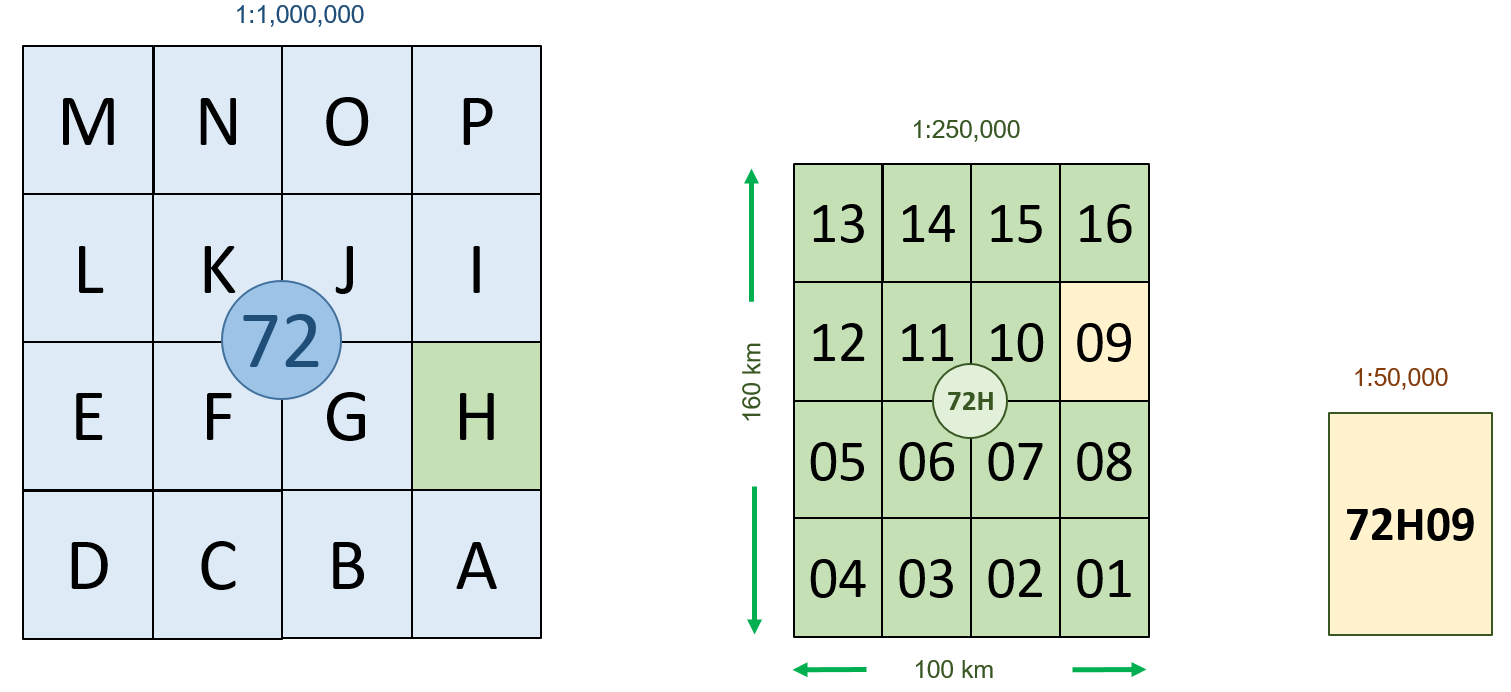
Figure 9: NTS System numbering scheme.
Each map sheet at the scale of 1:1,000,000 have sixteen map sheets at the scale of 1:25,000. The index number of map sheet at this scale is a three-digit number followed by a letter ranging from A through P (e.g., 72H). The index letter “A” starts from the south-east corner of the 1:1,000,000 map sheet. The alphabet keeps on moving forward toward west and jump north by one and move east. Each map sheet is 160 km by 100 km and covers an area of approximately 16,000 km2. These are reconnaissance type maps showing details of larger area. Map features may include roads and elevation contours. The contour interval could be 20 m or 50 m depending upon the terrain of the area.
Each map sheet at the scale of 1:250,000 is further divided into sixteen map sheets at a scale of 1:50,000. The indexation will be a three-digit number followed by a letter and a two-digit number (e.g. 72H09). Each map sheet is 40 km by 25 km and covers an area of approximately 1,000 km2. Approximately 740 map sheets at the scale of 1:50,000 would be required to cover the entire Saskatchewan. These detailed maps can be used for flood control, environmental issues, forest fire control/monitoring, infrastructure planning, natural resources development/management, real estate planning/development, vegetation/crop mapping, etc.
1:250,000 map sheets are identified by a combination of numbers and letters ranging from “A” through “P” (e.g. 098C). Sixteen smaller segments (1 to 16) form blocks used for 1:50,000 mapping (e.g. 098C03).
2.6.2 Military Grid Reference System (MGRS)
The North Atlantic Treaty Organization (NATO) designed a map reference system for the world. The system is derived from the Universal Transverse Mercator (UTM) projection system. Each UTM zone is divided into 20 quadrilaterals. A unique identification number for each quadrilateral is the UTM zone followed by a letter from “C” through “X”. The south-most is named “C” and the north-most is named “X”. The letters “I” and “O” were not used in the naming convention to avoid confusion with “1” and “0”. Each south UTM zone is named from “C” to “M” and each north UTM zone is named from “N” to “X”. The first 19 quadrilaterals (“C” to “W”) cover 8o in latitudes whereas the last quadrilateral covers 12o latitudes. The width of each quadrilateral is the same as the width of the UTM zone at that latitude. Saskatchewan is mostly covered by 13U and 13V.
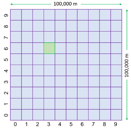
Each quadrilateral is divided into 100,000 m by 100,000 m squares. These squares are identified by a two-letter code. The first letter expresses the column, and the second letter defines the row number. Each UTM zone is divided into 8 columns. The left-most column of UTM zone 1 is “A” and its right-most column is “H”. The UTM zone 2 has its columns named “J” through “R”. Similarly, UTM zone 3 has columns “S” through “Z”. The column letter “A” starts over again from UTM zone 4. Thus, each column letter is repeated 20 times to cover all the 60 UTM zones of the world. Each quadrilateral is divided into 9 rows. The first row of the odd UTM North zone number (row just north of the equator) starts with letter “A” whereas the first row of the even UTM North zone number (row just north of the equator) starts with letter “F”. Again, letters “I” and “O” are not used for column or row identifiers. Saskatoon is covered by 13UCT, and Regina is covered by 13UER as shown in the following Figure 9. A map representing 100 Square km area is called level-1 map.
Each 100,000 m by 100,000 m square is further subdivided into 10,000 m by 10,000 m squares. These squares are labelled by two number digits. The first digit represents column, and the second digit represents row. Both columns and rows are labelled by digits “0” through “9”. A map representing 10 km by 10 km squares is called level-2 map. The convention continues to cover smaller squares of 1,000 m by 1,000 m area. These are level-3 maps.
The military grid maps are produced at different scales. A square grid is placed on each map. The units of gird interval are the units used on the map, usually meters. The scale and interval of these maps are given in the following Table 3.
|
Map Scale |
Interval |
Map Scale |
Interval |
|
1:12,500 |
1,000 |
1:100,000 |
10,000 |
|
1:25,000 |
1,000 |
1:250,000 |
10,000 |
|
1:50,000 |
1,000 |
1:500,000 |
10,000 |
|
1:100,000 |
1,000 |
1:1,000,000 |
100,000 with ticks at 10,000 |
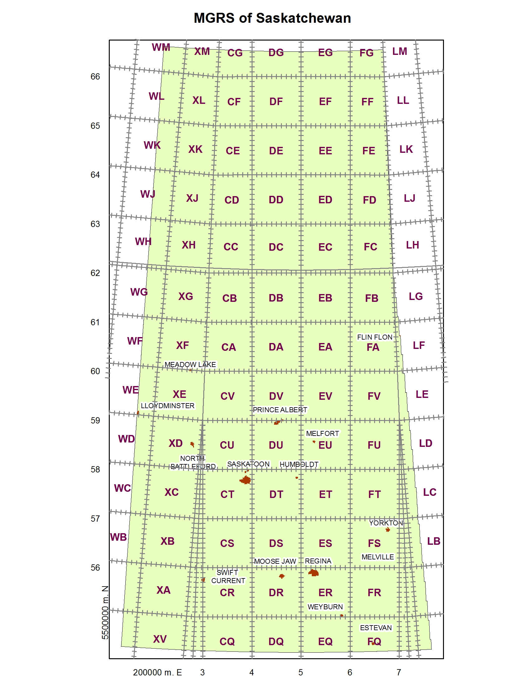
Level-1 Map (13UCT)
Saskatoon
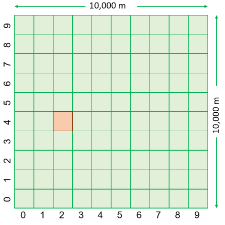
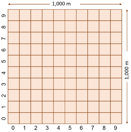
Level-2 Map (13UCT36)
Level-2 Map (13UCT3624Figure 10: MGRS numbering scheme.
Media Attributions
- Screenshot 2025-10-20 091546
- Screenshot 2025-10-20 092127
- Screenshot 2025-10-20 092127
